Custom Popup in SwiftUI
Popup is a kind of modal that appears in front of app content to provide critical information or ask for a decision.
SwiftUI provides many APIs to show alerts, popovers, action sheets, modal sheets. However, none of these allow us to present a custom popup or a snackbar. In this article, let’s build a reusable SwiftUI component for presenting custom popups and snackbars.
You can find the complete project on GitHub
Popup View Modifier
It’s convenient to design the popup as a ViewModifier that can be applied to any view:
struct Popup<T: View>: ViewModifier {
    let popup: T
    let isPresented: Bool

    // 1.
    init(isPresented: Bool, @ViewBuilder content: () -> T) {
        self.isPresented = isPresented
        popup = content()
    }

    // 2.
    func body(content: Content) -> some View {
        content
            .overlay(popupContent())
    }

    // 3.
    @ViewBuilder private func popupContent() -> some View {
        GeometryReader { geometry in
            if isPresented {
                popup
                    .frame(width: geometry.size.width, height: geometry.size.height)
            }
        }
    }
}
Here’s what’s going on in the code above:
- The popup is initialized with two arguments. The
isPresentedflag means whether the popup is currently visible onscreen. Thecontentclosure produces the popup sheet. It is marked with the @ViewBuilder attribute that enables us to use the SwiftUI declarative DSL. - In the
body()method we add the popup as an overlay to the parent view. GeometryReadereagerly takes all available space provided by its parent view. The popup withinGeometryReaderis shown or hidden based on theisPresentedproperty. We specifyframe()to correctly size and position the popup within the geometry reader.
You can learn more about the
@ViewBuilderattribute in Function Builders in Swift and SwiftUI.
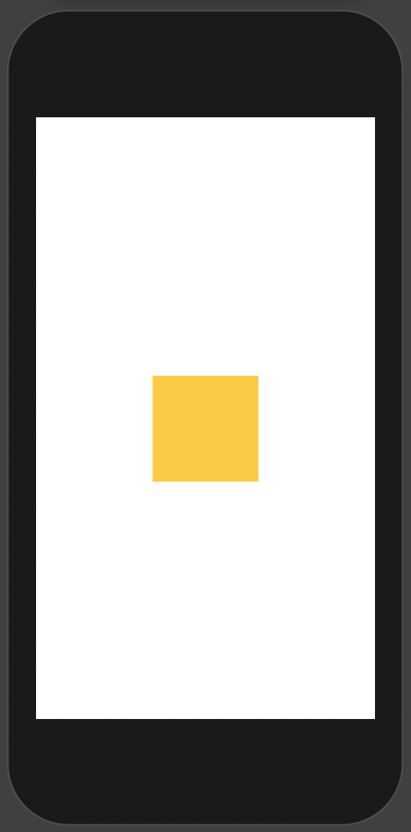
Let’s check the result on a SwiftUI preview:
struct Popup1_Previews: PreviewProvider {
    static var previews: some View {
        Color.clear
            .modifier(Popup(isPresented: true,
                            content: { Color.yellow.frame(width: 100, height: 100) }))
            .previewDevice("iPod touch")
    }
}
Aligning the Popup
By default, the popup is centered within GeometryReader bounds. To support custom alignment we need to pass an extra alignment argument to the popup frame() view modifier:
struct Popup<T: View>: ViewModifier {
    ...
    let alignment: Alignment // (*)

    init(isPresented: Bool, alignment: Alignment, @ViewBuilder content: () -> T) { // (*)
        self.isPresented = isPresented
        self.alignment = alignment // (*)
        popup = content()
    }
    ...
    @ViewBuilder private func popupContent() -> some View {
        GeometryReader { geometry in
            if isPresented {
                popup
                    .frame(width: geometry.size.width, height: geometry.size.height, alignment: alignment) // (*)
            }
        }
    }
    ...
}
We receive the alignment argument in the Popup initializer and pass it to the popup frame. The changes are marked with the (*) symbol.
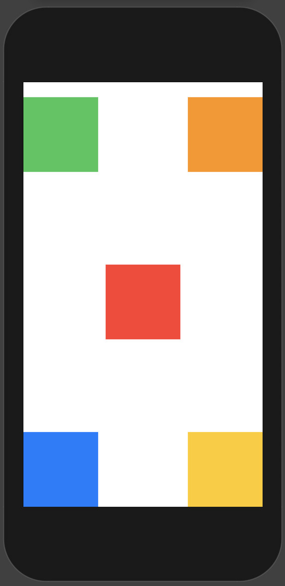
Let’s update the preview to showcase different popup alignments:
struct Popup2_Previews: PreviewProvider {
    static var previews: some View {
        Color.clear
            .modifier(Popup(isPresented: true,
                            alignment: .topTrailing,
                            content: { Color.orange.frame(width: 100, height: 100) }))
            ...
            .modifier(Popup(isPresented: true,
                            alignment: .bottomLeading,
                            content: { Color.blue.frame(width: 100, height: 100) }))
            .previewDevice("iPod touch")
    }
}
Animating Popup Transition
To create an animated transition, we add the animation() and transition() view modifiers to the popup:
struct Popup<T: View>: ViewModifier {
    ...
    @ViewBuilder private func popupContent() -> some View {
        GeometryReader { geometry in
            if isPresented {
                popup
                    .animation(.spring()) // 1.
                    .transition(.offset(x: 0, y: geometry.belowScreenEdge)) // 2.
                    .frame(width: geometry.size.width, height: geometry.size.height, alignment: alignment)
            }
        }
    }
}

// 3.
private extension GeometryProxy {
    var belowScreenEdge: CGFloat {
        UIScreen.main.bounds.height - frame(in: .global).minY
    }
}
Here the highlights from the code above:
- When we set the
animation(_:)modifier on a view, SwiftUI animates any changes to the animatable properties of the view. In our case, we are going to animate view position. - The
transition(_:)modifier specifies how a view appears and disappears. It has no effect on its own and must be associated with an animation. In our case, we set the offset transition that moves the popup from the bottom screen edge. - Calculate the popup position below the screen edge.
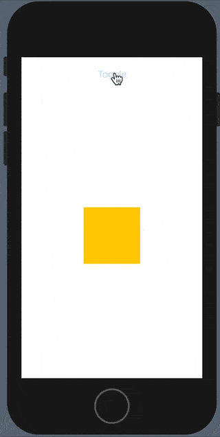
To see the animation in action, we add a button to the preview that toggles the popup presentation:
struct Popup3_Previews: PreviewProvider {

    static var previews: some View {
        Preview()
            .previewDevice("iPod touch")
    }

    // Helper view that shows a popup
    struct Preview: View {
        @State var isPresented = false

        var body: some View {
            ZStack {
                Color.clear
                VStack {
                    Button("Toggle", action: { isPresented.toggle() })
                    Spacer()
                }
            }
            .modifier(Popup(isPresented: isPresented,
                            alignment: .center,
                            content: { Color.yellow.frame(width: 100, height: 100) }))
        }
    }
}
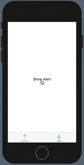
Now the popup appears and disappears with animation:
Adding Direction
It’s common to have a popup that slides from the top of the screen. However, the current Popup animation is fixed in a way that the popup always appears from the bottom edge. Let’s add versatility to our component and support two different animation directions:
extension Popup {
    enum Direction {
        case top, bottom

        func offset(popupFrame: CGRect) -> CGFloat {
            switch self {
            case .top:
                let aboveScreenEdge = -popupFrame.maxY
                return aboveScreenEdge
            case .bottom:
                let belowScreenEdge = UIScreen.main.bounds.height - popupFrame.minY
                return belowScreenEdge
            }
        }
    }
}
Here we calculate popup offset based on the animation direction:
struct Popup<T: View>: ViewModifier {
    ...
    let direction: Direction // (*)

    init(isPresented: Bool, alignment: Alignment, direction: Direction, @ViewBuilder content: () -> T) { // (*)
        self.isPresented = isPresented
        self.alignment = alignment
        self.direction = direction // (*)
        popup = content()
    }
    ...
    @ViewBuilder private func popupContent() -> some View {
        GeometryReader { geometry in
            if isPresented {
                popup
                    .animation(.spring())
                    .transition(.offset(x: 0, y: direction.offset(popupFrame: geometry.frame(in: .global)))) // (*)
                    .frame(width: geometry.size.width, height: geometry.size.height, alignment: alignment)
            }
        }
    }
}
This code adds a new direction property and calculates the transition offset based on the direction and the popup frame. The changes are marked with the (*) symbol.
Then add a conveniece extension to SwiftUI View that applies the Popup view modifier:
extension View {
    func popup<T: View>(
        isPresented: Bool,
        alignment: Alignment = .center,
        direction: Popup<T>.Direction = .bottom,
        @ViewBuilder content: () -> T
    ) -> some View {
        return modifier(Popup(isPresented: isPresented, alignment: alignment, direction: direction, content: content))
    }
}
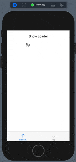
The final demo shows several practical Popup use cases, namely a loading indicator and a message snackbar:
struct ContentView: View {
    @State private var isLoaderPresented = false
    @State private var isTopSnackbarPresented = false

    var body: some View {
        TabView {
            leftTab
            rightTab
        }
        .popup(isPresented: isTopSnackbarPresented, alignment: .top, direction: .top, content: Snackbar.init)
        .popup(isPresented: isLoaderPresented, alignment: .center, content: Loader.init)
    }

    private var leftTab: some View { ... }

    private var rightTab: some View { ... }
}

struct ContentView_Previews: PreviewProvider {
    static var previews: some View {
        ContentView()
    }
}
The next demo shows a loading indicator appearing from the bottom:
And here is a snackbar message appearing from the top:
Source Code
You can find the complete project on GitHub. It is published under the “Unlicense”, which allows you to do whatever you want with it.
Thanks for reading!
If you enjoyed this post, be sure to follow me on Twitter to keep up with the new content. There I write daily on iOS development, programming, and Swift.