Collection View with Sticky Rows and Columns: Step by Step Tutorial
In this article you will learn how to implement collection view that has sticky rows and columns, and supports both vertical and horizontal scrolling using Swift.
Introduction
Collection view lends itself to managing ordered data items and displaying them using configurable layouts. It is arguably the most flexible control in iOS: tables, grids, pages, you name it — literally any control can be implemented by means of collection views.
Such a high level of customization is achieved primarily by decoupling presentation, positioning and event-handling responsibilities. Here are the key actors of UICollectionView along with their roles:
UICollectionViewDataSource— is responsible for providing the data and views to be rendered by the collection view.UICollectionViewDelegate— allows to control selection events.UICollectionViewLayout— determines positioning of cells and supplementary elements.
To design a grid with arbitrary number of sticky rows and columns we should focus our efforts on presentation which is the responsibility of UICollectionViewLayout.
Understanding UICollectionViewLayout
Before diving into code, we must clearly understand how the collection view layout works and which customization options does it offer.
UICollectionViewLayout is an abstract class responsible for items and supplementary views placement inside the collection view bounds. Collection view consults with its layout before presenting elements on the screen, that allows to come up with literally any kind of placement.
By default, collection view comes with UICollectionViewFlowLayout that organizes items into a grid. The flow layout uses UICollectionViewDelegateFlowLayout protocol to coordinate the size of elements and spacing between them. Our implementation will rely on the methods from this protocol to be as much extensible as possible.
Getting Started
Throughout the tutorial we will build a reusable solution on top of UICollectionViewFlowLayout that does next things:
- Supports vertical and horizontal scrolling simultaneously.
- Positions cells into a grid.
- Has configurable number of sticky rows and columns.
After we specified our goals, we are ready to get started. Each subsequent section fulfills one goal from the list and moves us one step closer to the final solution.
Let’s begin with downloading the starter project. It will save you some time on writing boilerplate code and will also make sure that we are totally aligned before starting the development.
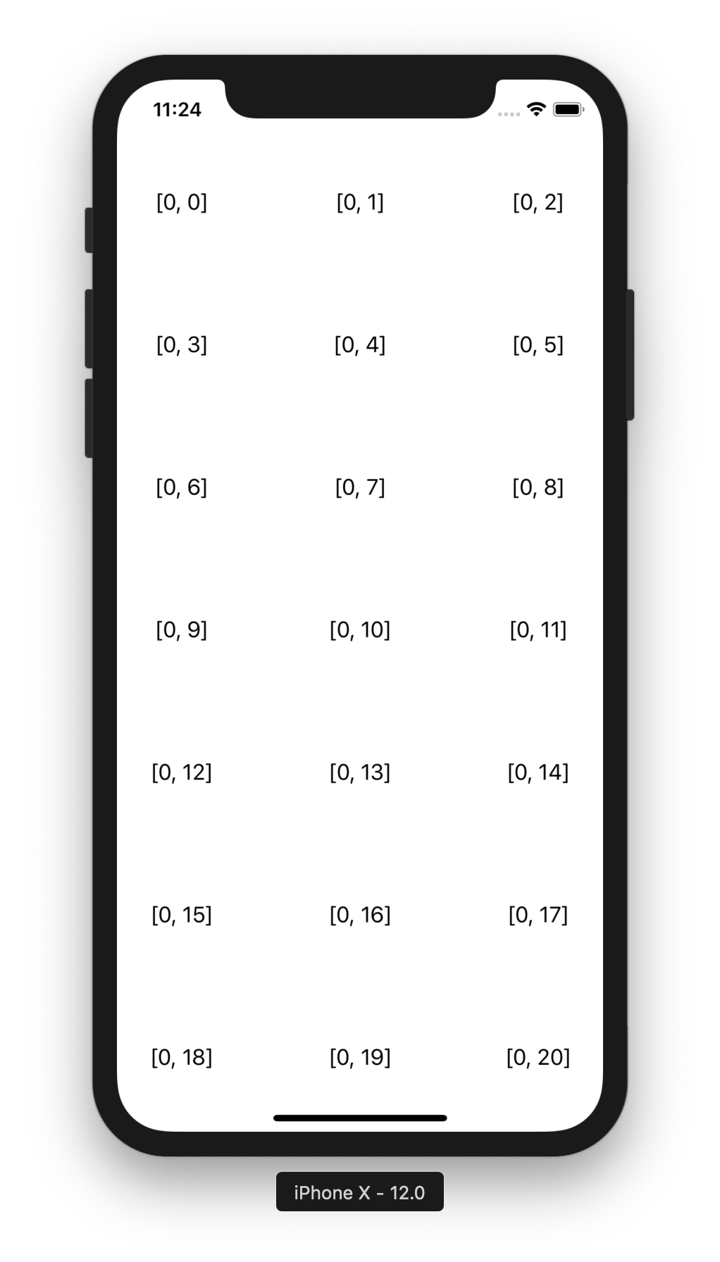
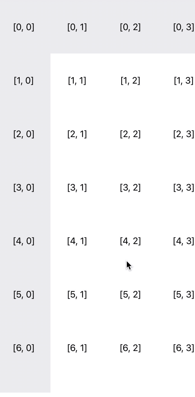
When you run it, you see a simple collection view with 10000 cells - 100 sections, 100 items per section - each showing its index path.
Here are some important highlights to pinpoint in starter project:
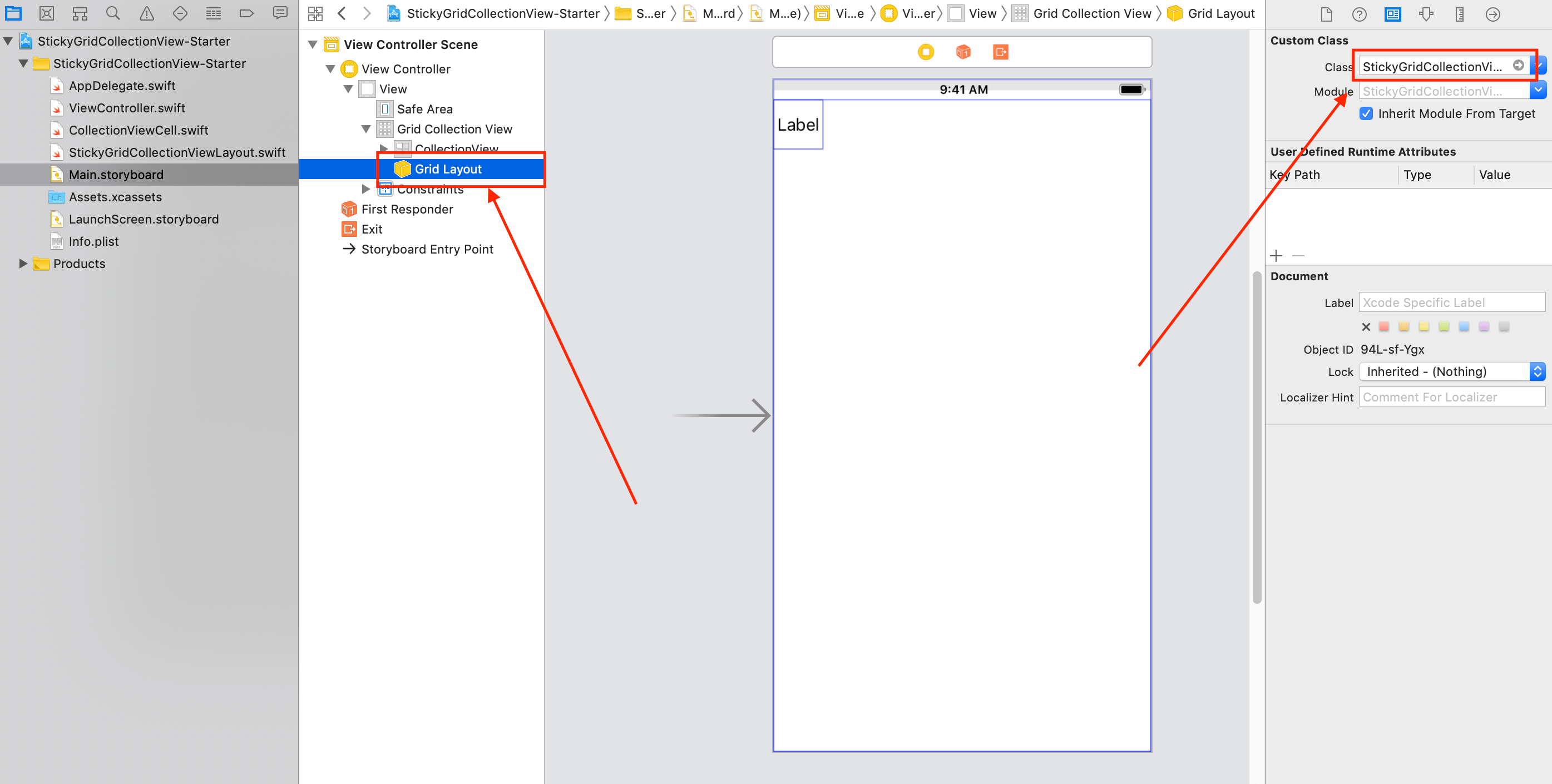
ViewController— is configured inMain.storyboardand already wired up with the collection view and its layout.StickyGridCollectionViewLayout— an empty subclass of the flow layout.CollectionViewCell— a simple collection view cell subclass with a title label.
Here is how StickyGridCollectionViewLayout is set in interface builder:
Adding Horizontal and Vertical Scrolling
By default, the flow layout supports either horizontal or vertical scrolling. In our project 3 cells fit the screen horizontally which results in a grid with 3333 rows and 3 columns. The content size of such grid equals to 333300 x 300 px.
The square grid of the same size occupies 10000 x 10000 px. Let’s override the content size property in StickyGridCollectionViewLayout to see how the collection view scroll will behave:
override var collectionViewContentSize: CGSize {
    return CGSize(width: 10_000, height: 10_000)
}
Now run the project and play with the scroll. The result is next:
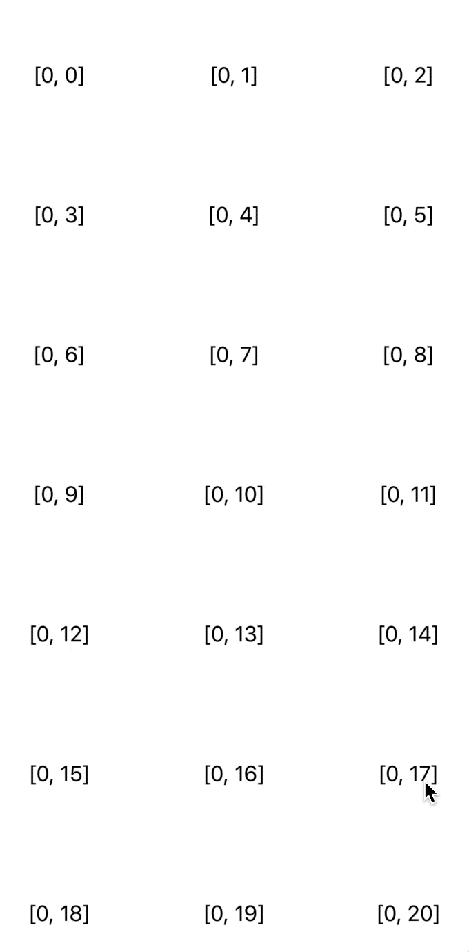
Collection view is smart about scrolling and adapts automatically to the content size of its layout. Although we have reached our the goal of simultaneous horizontal and vertical scroll, the cells placement does not seem to be correct.
Positioning Cells into Grid
The next step is to properly position cells within the collection view bounds.
Before rendering its cells, the collection view calls layoutAttributesForElements(in:) that returns an array of cells attributes. Instead of drawing all cells at once, the collection view passes visible rectangle to that method and expects it to return attributes only for the visible cells which has a positive impact on performance. We override that method in our subclass to return custom attributes:
private var allAttributes: [[UICollectionViewLayoutAttributes]] = []

override func layoutAttributesForElements(in rect: CGRect) -> [UICollectionViewLayoutAttributes]? {
    var layoutAttributes = [UICollectionViewLayoutAttributes]()

    for rowAttrs in allAttributes {
        for itemAttrs in rowAttrs where rect.intersects(itemAttrs.frame) {
            layoutAttributes.append(itemAttrs)
        }
    }

    return layoutAttributes
}
The allAttributes property is a two-dimensional array that contains attributes for the whole grid. For instance, to access individual cell attributes you would write:
let cellAttributes = allAttributes[row][column]
In layoutAttributesForElements(in:) we iterate through the allAttributes array and pick the ones that fall within the specified rectangle.
This method is called very often and has huge influence over the performance. As an optimization measure, we pre-calculate the attributes and save them to the property. The right place to setup attributes is prepare() method which is called each time the collection view layout is invalidated.
override func prepare() {
    setupAttributes()
}

private func setupAttributes() {
    // 1
    allAttributes = []

    var xOffset: CGFloat = 0
    var yOffset: CGFloat = 0

    // 2
    for row in 0..<rowsCount {
        // 3
        var rowAttrs: [UICollectionViewLayoutAttributes] = []
        xOffset = 0

        // 4
        for col in 0..<columnsCount(in: row) {
            // 5
            let itemSize = size(forRow: row, column: col)
            let indexPath = IndexPath(row: row, column: col)
            let attributes = UICollectionViewLayoutAttributes(forCellWith: indexPath)
            attributes.frame = CGRect(x: xOffset, y: yOffset, width: itemSize.width, height: itemSize.height).integral

            rowAttrs.append(attributes)

            xOffset += itemSize.width
        }

        // 6
        yOffset += rowAttrs.last?.frame.height ?? 0.0
        allAttributes.append(rowAttrs)
    }
}
For now let’s ignore compiler’s warnings to better understand the logic flow.
- Remove all previously calculated attributes as they might be no longer relevant, and initialize offset variables.
- Iterate over all rows within a grid. When working with a grid, it is easier to think about cells in terms of rows in columns rather than items and sections. For this purpose we will implement
rowsCountandcolumnsCount(in:)later. - Make preparations before we calculate attributes for next row. Each row must begin with 0 position, thus we need to reset
xOffset. Attributes of each row are stored inrowAttrsarray. - Iterate over all columns within a row.
- Calculate a frame of a cell. We are accumulating
xOffsetandyOffsetto position the cell correctly within the grid. The size is received from the new methodsize(forRow:,column:)that will be implemented later. - Lastly, the row attributes are appended to
allAttributesthat contains attributes for the whole grid.
After we understand the logic flow of the setupAttributes() method, we are ready to implement several helpers that are causing compiler warnings.
// MARK: - Sizing

private var rowsCount: Int {
    return collectionView!.numberOfSections
}

private func columnsCount(in row: Int) -> Int {
    return collectionView!.numberOfItems(inSection: row)
}

private func size(forRow row: Int, column: Int) -> CGSize {
    guard let delegate = collectionView?.delegate as? UICollectionViewDelegateFlowLayout,
        let size = delegate.collectionView?(collectionView!, layout: self, sizeForItemAt: IndexPath(row: row, column: column)) else {
        assertionFailure("Implement collectionView(_,layout:,sizeForItemAt: in UICollectionViewDelegateFlowLayout")
        return .zero
    }

    return size
}
Methods rowsCount and columnsCount(in:) make the conversion from sections and items into rows and columns. We can safely force unwrap collectionView here, because the collection view always has a layout object set. The opposite is also true since we are not going to use the layout without the collection view.
The method size(forRow:,column:) asks a flow layout delegate to provide the size for an item and does several safety checks. The validations enforce all flow layout delegates to return sizes of the cells.
The only thing that is left is small utility method that converts row and column into IndexPath:
private extension IndexPath {
    init(row: Int, column: Int) {
        self = IndexPath(item: column, section: row)
    }
}
Now you can run the app to see the result:
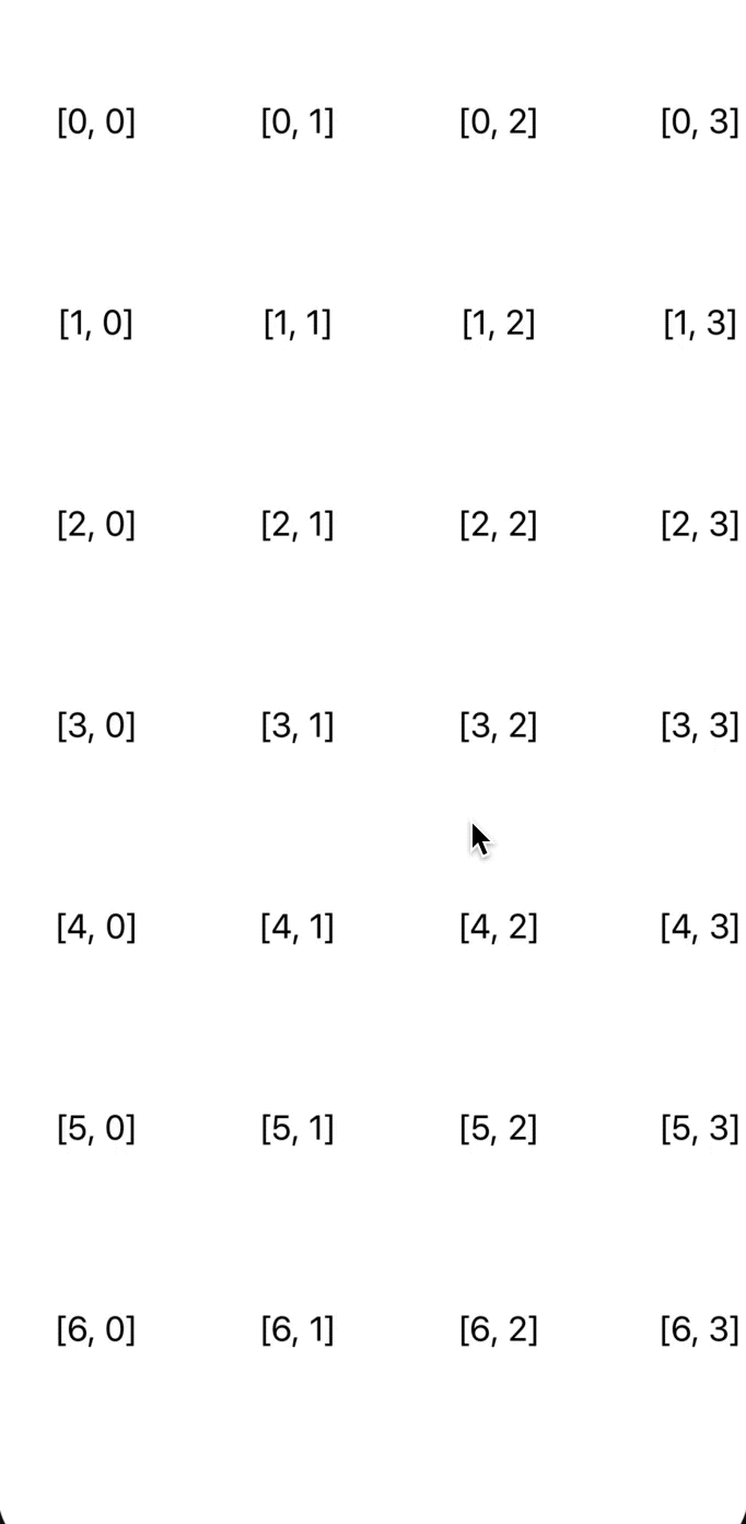
Another goal fulfilled! Let’s move on to adding sticky rows and columns to our collection view layout.
Adding Sticky Rows and Columns to Collection View
First, we add two new properties with the number of sticky rows and columns to our collection view layout.
var stickyRowsCount = 0 {
    didSet {
        invalidateLayout()
    }
}

var stickyColumnsCount = 0 {
    didSet {
        invalidateLayout()
    }
}
Every time the number of sticky rows or columns changes, the layout is explicitly invalidated that in its turn triggers preload().
To ensure that the sticky items are positioned correctly, their placement must be adjusted every time the collection view bounds change, for example when scrolling occurs. The collection view must be told explicitly that the layout wants its attributes to be re-calculated when the bounds change. For this purpose we introduce the new method below.
override func shouldInvalidateLayout(forBoundsChange newBounds: CGRect) -> Bool {
    return true
}
The method updateStickyItemsPositions() does the actual placement of sticky rows and columns.
override func prepare() {
    setupAttributes()
    // 1
    updateStickyItemsPositions()
}

private func updateStickyItemsPositions() {
    // 2
    for row in 0..<rowsCount {
        for col in 0..<columnsCount(in: row) {
            // 3
            let attributes = allAttributes[row][col]

            // 4
            if row < stickyRowsCount {
                var frame = attributes.frame
                frame.origin.y += collectionView!.contentOffset.y
                attributes.frame = frame
            }

            if col < stickyColumnsCount {
                var frame = attributes.frame
                frame.origin.x += collectionView!.contentOffset.x
                attributes.frame = frame
            }

            // 5
            attributes.zIndex = zIndex(forRow: row, column: col)
        }
    }
}
Here is step by step explanation of the logic flow.
- We want to updates sticky items each time the
preload()is called. - Iterate over all rows and columns in the grid.
- Here an assumption is made that attributes have already been cached in
allAttributes, thus the order in which the methods are called withinprepare()is highly important. - Positions of sticky items are updated with collection view offset. By doing this we pin sticky items to the corresponding edges of the collection view.
- Besides updating the positions, we must ensure that sticky items are always placed above the rest of the cells. The new helper method
zIndex(forRow:column:)will be implement for this purpose.
Z-index (or Z-order) is a common attribute in programming APIs that defines the stack order of specific element within UI hierarchy. When two elements overlap, their Z-index determined which one appears on the top of the other. In our case, we distinguish 3 kinds of Z-orders:
- Sticky cells that are intersection of sticky rows and columns — are always on the top.
- The rest of sticky cells — are in the middle.
- Regular collection view cells — are at the bottom.
zIndex method implementation reflects this:
private func zIndex(forRow row: Int, column col: Int) -> Int {
    if row < stickyRowsCount && col < stickyColumnsCount {
        return ZOrder.staticStickyItem
    } else if row < stickyRowsCount || col < stickyColumnsCount {
        return ZOrder.stickyItem
    } else {
        return ZOrder.commonItem
    }
}

// MARK: - ZOrder

private enum ZOrder {
    static let commonItem = 0
    static let stickyItem = 1
    static let staticStickyItem = 2
}
Lastly, we need to set the actual number of sticky items. Go to ViewController.swift and add following lines to the gridLayout property:
@IBOutlet weak var gridLayout: StickyGridCollectionViewLayout! {
    didSet {
        gridLayout.stickyRowsCount = 1
        gridLayout.stickyColumnsCount = 1
    }
}
Let’s highlight sticky items to make visually different from the rest of the cells:
func collectionView(_ collectionView: UICollectionView, cellForItemAt indexPath: IndexPath) -> UICollectionViewCell {
    guard let cell = collectionView.dequeueReusableCell(withReuseIdentifier: CollectionViewCell.reuseID, for: indexPath) as? CollectionViewCell else {
        return UICollectionViewCell()
    }

    cell.titleLabel.text = "\(indexPath)"
    cell.backgroundColor = gridLayout.isItemSticky(at: indexPath) ? .groupTableViewBackground : .white

    return cell
}
The code will not compile, because we need to implement isItemSticky(at:). Add the below code to StickyGridCollectionViewLayout class:
func isItemSticky(at indexPath: IndexPath) -> Bool {
    return indexPath.item < stickyColumnsCount || indexPath.section < stickyRowsCount
}
With that done, you are ready to see your hard work in action! Run the app and play around with it, and you will see it working as intended:
The last small that is left is to replace the hard coded content size with the dynamic one. First, we create a new property in our layout subclass:
private var contentSize = CGSize.zero
The content size needs to be updated each time the layout changes, i.e. in prepare():
override func prepare() {
    setupAttributes()
    updateStickyItemsPositions()

    let lastItemFrame = allAttributes.last?.last?.frame ?? .zero
    contentSize = CGSize(width: lastItemFrame.maxX, height: lastItemFrame.maxY)
}
Lastly, replace the hard coded content value with the new one:
override var collectionViewContentSize: CGSize {
    return contentSize
}
You can play with the number of collection view cells and their sizes to see how the layout adapts.
Source Code
Here you can find the links to the projects:
Pull requests and issues are warmly welcome.
Summary
Collection views are among the most widely adopted user interface components in iOS. Separation of presentation, positioning and event-handling responsibilities gives collection views lots of flexibility.
Collection view communicates closely with its layout to position cells within its bounds. UICollectionViewFlowLayout is the default layout that arranges cells in a grid.
By subclassing and overriding the flow layout we came up with a UICollectionView that has variable number of sticky rows and columns and supports scrolling in both horizontal and vertical directions.
StickyGridCollectionViewLayout that we have built is highly customizable and can be plugged in via interface builder or programmatically.
Thanks for reading!
If you enjoyed this post, be sure to follow me on Twitter to keep up with the new content. There I write daily on iOS development, programming, and Swift.